Welcome to Vegan Bowls
Welcome to Vegan Bowls

5 Tips to Improve Food Photography
November 11, 2020 3 min read

ARTICLE / PHOTOS: @THEMINDFULHAPA
Food photography doesn’t have to be hard! With these five simple tips you’ll learn some easy tips to start elevating your food photos. Consider these steps as a guideline for creating attention capturing content that draws people in! And best yet, these are all free ways to elevate your photography game, no money required, just patience and practice :)
1. Add Texture
2. Set Ingredients Aside
The tendency when photographing food is to shoot the finished product. However, with savory meals or anything that is homogeneous (like soup, curries, or stir frys), its best to set aside the key ingredients of the dish so that viewers can see everything clearly. There’s two ways to do this and both will improve the quality of your photos.
-
The first is that for a dish with many ingredients it’s best to leave out some out from the finished meal and have them arranged artfully in bowls, on plates, or on the backdrop itself to tell the story of the dish.
- The second is that for a dish like soup, leaving a few pieces of each star ingredient out to place on top right before photographing ensures that everything is seen! Otherwise your soup ingredients may sink or lose their fresh, crisp appearance from sitting in the mixture.
3. Garnish
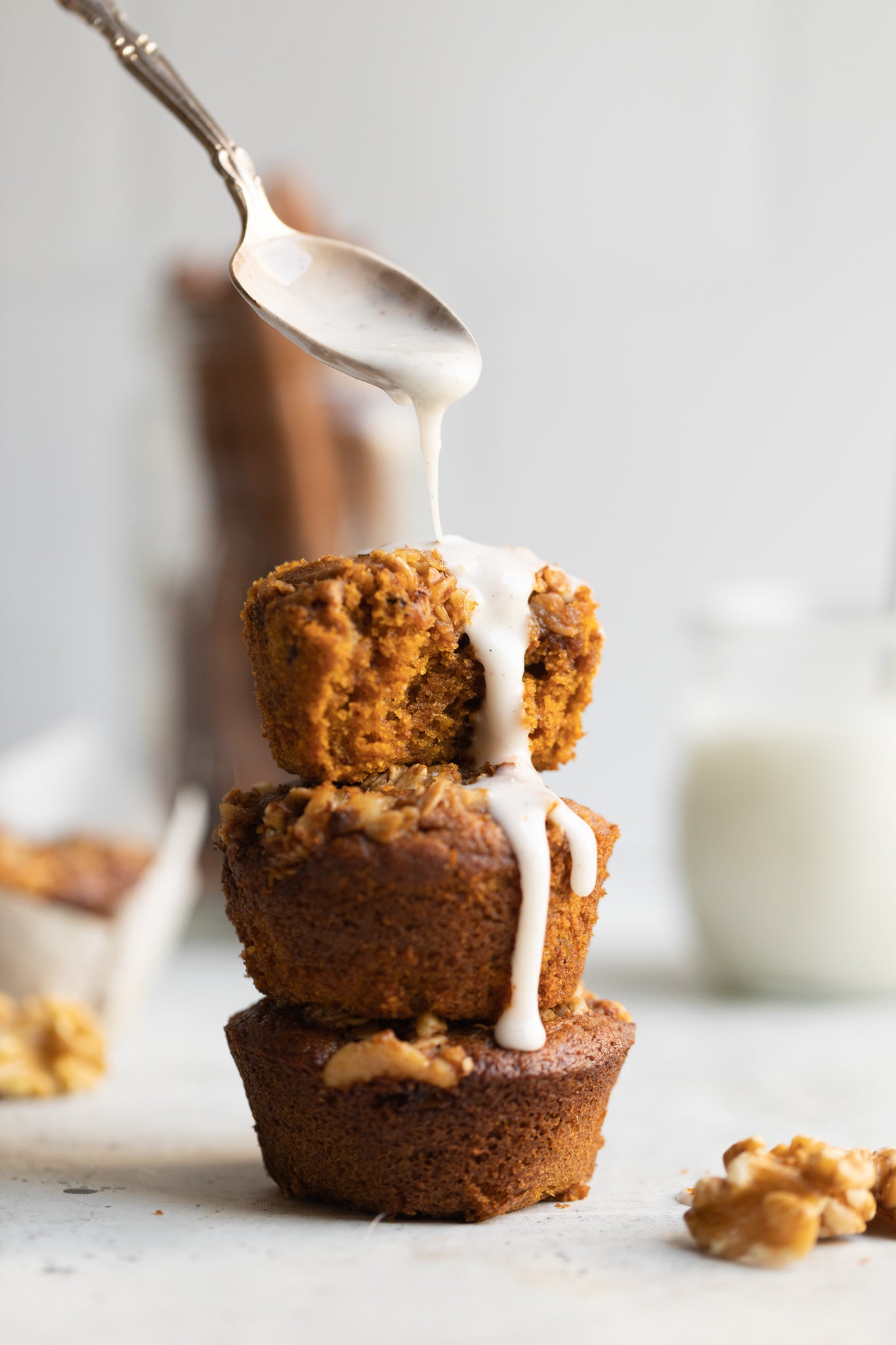
 This step may seem like a hassle at times but it’s an important tip to remember. Garnishing your food adds texture and as we discussed above, and this is important because it helps add layers to the final photo. Besides that, garnishes also add contrast which draws attention and interest to the photograph. An example of this is chopped parsley or basil, red pepper flakes or sesame seeds for savory and for sweets something like chopped nuts, chocolate shavings, sprinkles, or even a glaze.
Another tip for garnishes in particular is to look for contrasts with color. I advise you to refer to the color wheel and find color pairings that contrast each other. This adds that extra pop of attention to your photographs! An example would be chopped green herbs on a red tomato sauce for lasagna or even a white glaze on chocolate cake.
4. Play with Lighting
Playing around with lighting can change the entire look of your photography! It can be easy to stick with what you know looks ‘good’ but what if you explore a bit and find even better lighting? Try adjusting your style for backlit versus side light or at what time of day you shoot. Another thing to consider is how deep you want the shadows to be. If you’re going for dark shadows add a black bounce board and for soft shadows add a white bounce board. Play around with it and compare your photos with the different layouts and light levels to determine what works best.
5. Study what you like
FIND MORE HELPFUL TIPS, BE SURE TO CHECK OUT THEMINDFULHAPA.COM AND @THEMINDFULHAPA ON INSTAGRAM!
Subscribe
Sign up to get the latest on sales, new releases and more …


